# CSS3 新特性
# 知识点
- CSS3 新增选择器
- 文本阴影
- 文本溢出
- 圆角边框
- 盒子阴影
- 背景属性
- 渐变属性
- 元素转换
- 过渡属性
- 动画
# CSS3 新增选择器
在前面我们已经学习了元素选择器、id 选择器和类选择器,我们可以通过标签名、id 名、类名给指定元素设置样式。
现在我们继续选择器之旅,学习 CSS3 中新增的三类选择器,分别是:
- 属性选择器
- 子元素伪类选择器
- UI 伪类选择器
# 新增属性选择器
属性选择器就是通过正则的方式去匹配指定属性的元素,为其设置样式。
在 CSS3 中新增了三种属性选择器,如下所示:
| 选择器 | 描述 |
|---|---|
| E[attr^=“xx”] | 选择元素 E,其中 E 元素的 attr 属性是以 xx 开头的任何字符。 |
| E[attr$=“xx”] | 选择元素 E,其中 E 元素的 attr 属性是以 xx 结尾的任何字符。 |
| E[attr*=“xx”] | 选择元素 E,其中 E 元素的 attr 属性是包含 xx 的任何字符。 |
我们来举个例子吧
建一个 index.html 文件,在其中写入以下内容。
<!DOCTYPE html> | |
<html lang="en"> | |
<head> | |
<meta charset="UTF-8" /> | |
<meta name="viewport" content="width=device-width, initial-scale=1.0" /> | |
<title>Document</title> | |
<style> | |
a[href^="#"] { | |
color: rgb(179, 255, 0); | |
} | |
a[href$="org"] { | |
color: rgb(195, 0, 255); | |
} | |
a[href*="un"] { | |
background-color: rgb(0, 255, 149); | |
color: white; | |
} | |
</style> | |
</head> | |
<body> | |
<ul> | |
<li><a href="#">本地链接</a></li> | |
<li><a href="https://www.lanqiao.cn">蓝桥云课</a></li> | |
<li><a href="https://developer.mozilla.org">MDN</a></li> | |
<li><a href="https://unsplash.com">Unsplash</a></li> | |
</ul> | |
</body> | |
</html> |
预览页面,效果如下:
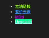
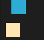
- 在上面代码中,我们使用
a[href^="#"]去匹配a标签中href属性值以#开头的元素。 - 使用
a[href$="org"]去匹配a标签中href属性值以org结尾的元素。 - 使用
a[href*="un"]去匹配a标签中href属性值包含un的元素。
# 子元素伪类选择器
子元素伪类选择器就是选择某元素的子元素的一种选择器。
在 CSS3 中,有以下几种子元素伪类选择器:
| 选择器 | 描述 |
|---|---|
| E:first-child | 选择元素 E 的第一个子元素。 |
| E:last-child | 选择元素 E 的最后一个子元素。 |
| E:nth-child(n) | 选择元素 E 的第 n 个子元素,n 有三种取值,数字、odd 和 even。注意第一个子元素的下标是 1。 |
| E:only-child | 选择元素 E 下唯一的子元素。 |
| E:first-of-type | 选择父元素下第一个 E 类型的子元素。 |
| E:last-of-type | 选择父元素下最后一个 E 类型的子元素。 |
| E:nth-of-type(n) | 选择父元素下第 n 个 E 类型的子元素,n 有三种取值,数字、odd 和 even。 |
| E:only-of-type | 选择父元素唯一的 E 类型的子元素。 |
| E:nth-last-child(n) | 选择所有 E 元素倒数的第 n 个子元素。 |
| E:nth-last-of-type(n) | 选择所有 E 元素倒数的第 n 个为 E 的子元素。 |
我们来举个例子吧
新建一个 index1.html 文件,在其中写入以下内容。
<!DOCTYPE html> | |
<html lang="en"> | |
<head> | |
<meta charset="UTF-8" /> | |
<meta name="viewport" content="width=device-width, initial-scale=1.0" /> | |
<title>Document</title> | |
<style> | |
div { | |
width: 100px; | |
height: 100px; | |
margin-top: 10px; | |
background-color: rgb(0, 255, 242); | |
} | |
div:nth-child(2) { | |
background-color: rgb(0, 255, 128); | |
} | |
div:nth-of-type(4) { | |
background-color: rgb(111, 0, 255); | |
} | |
</style> | |
</head> | |
<body> | |
<div></div> | |
<div></div> | |
<div></div> | |
<div></div> | |
</body> | |
</html> |
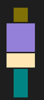
预览页面,效果如下:
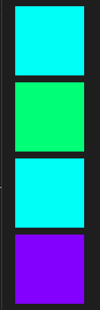
- 在代码中,我们使用
div:nth-child(2)给div的第 2 个子元素添加绿色背景颜色。 - 使用
div:nth-of-type(4)给父元素下第 4 个div子元素添加紫色背景颜色。
<!DOCTYPE html> | |
<html> | |
<head> | |
<style> | |
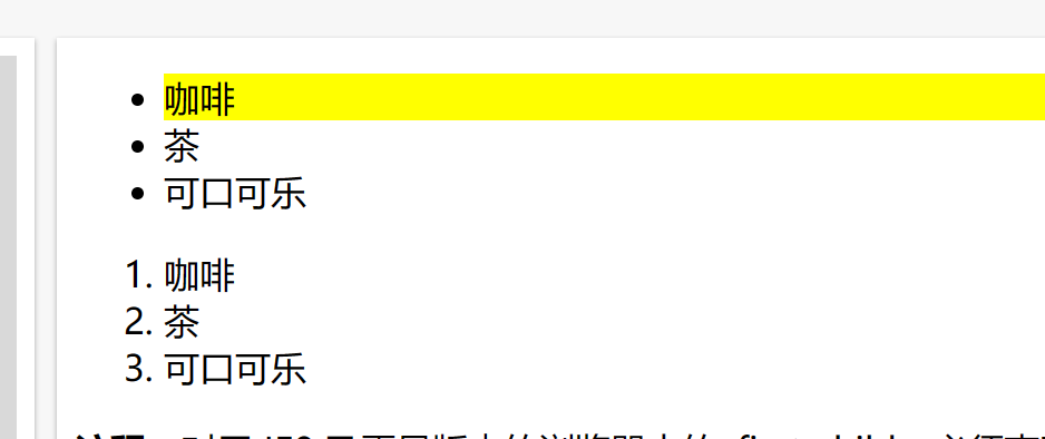
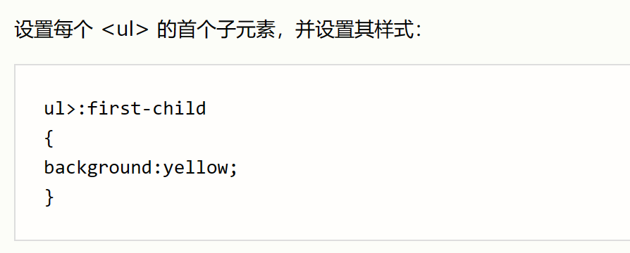
ul>:first-child | |
{ | |
background:yellow; | |
} | |
</style> | |
</head> | |
<body> | |
<ul> | |
<li>咖啡</li> | |
<li>茶</li> | |
<li>可口可乐</li> | |
</ul> | |
<ol> | |
<li>咖啡</li> | |
<li>茶</li> | |
<li>可口可乐</li> | |
</ol> | |
<p><b>注释:</b>对于 IE8 及更早版本的浏览器中的 :first-child,必须声明 <!DOCTYPE>。</p> | |
</body> | |
</html> |
# UI 伪类选择器
UI 伪类选择器是通过元素的状态来选择的一种选择器。
在 CSS3 中有以下几种 UI 伪类选择器。
| 选择器 | 描述 |
|---|---|
| :focus | 给获取焦点的元素设置样式。 |
| ::selection | 给页面中被选中的文本内容设置样式。 |
| :checked | 给被选中的单选框或者复选框设置样式。 |
| :enabled | 给可用的表单设置样式。 |
| :disabled | 给不可用的表单设置样式。 |
| :read-only | 给只读表单设置样式。 |
| :read-write | 给可读写的表单元素设置样式。 |
| :valid | 验证有效。 |
| :invalid | 验证无效。 |
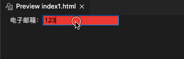
# 练习一:属性有效性验证
页面上有一个邮箱输入框,当你的输入满足邮箱格式时,输入框的背景颜色为绿色;当你的输入不满足要求,背景颜色为红色。
新建一个 index2.html 文件,在其中写入以下内容。
<!DOCTYPE html> | |
<html lang="en"> | |
<head> | |
<meta charset="UTF-8" /> | |
<meta name="viewport" content="width=device-width, initial-scale=1.0" /> | |
<title>Document</title> | |
<style> | |
/* 格式错误 */ | |
input:invalid { | |
background-color: red; | |
} | |
/* 格式正确 */ | |
input:valid { | |
background-color: green; | |
} | |
</style> | |
</head> | |
<body> | |
电子邮箱:<input type="email" /> | |
</body> | |
</html> |
预览页面,效果如下:
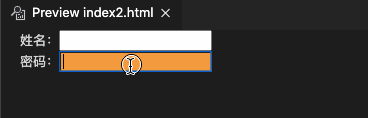
# 练习二:获得焦点验证
页面上有一个姓名输入框和一个密码输入框,当聚焦输入框时,输入框的背景颜色会发生改变,
新建一个 index3.html 文件,在其中写入以下内容。
<!DOCTYPE html> | |
<html lang="en"> | |
<head> | |
<meta charset="UTF-8" /> | |
<meta name="viewport" content="width=device-width, initial-scale=1.0" /> | |
<title>Document</title> | |
<style> | |
input:focus { | |
background-color: rgb(255, 153, 0); | |
} | |
</style> | |
</head> | |
<body> | |
姓名:<input type="text" /><br /> | |
密码:<input type="password" /> | |
</body> | |
</html> |
预览页面,效果如下:
# 文本阴影
某些时候我们想让字体看起来更立体,更具艺术性,让人眼前一亮,可以给文字使用文本阴影属性。
在 CSS3 中,我们使用 text-shadow 属性来给文本内容添加阴影的效果。
文本阴影的语法格式如下:
text-shadow: x-offset y-offset blur color; |
x-offset是沿 x 轴方向的偏移距离,允许负值,必须参数。y-offset是沿 y 轴方向的偏移距离,允许负值,必须参数。blur是阴影的模糊程度,可选参数。color是阴影的颜色,可选参数。
我们来举个例子吧!
新建一个 index4.html 文件,在其中写入以下内容。
<!DOCTYPE html> | |
<html lang="en"> | |
<head> | |
<meta charset="UTF-8" /> | |
<meta name="viewport" content="width=device-width, initial-scale=1.0" /> | |
<title>Document</title> | |
<style> | |
div { | |
font-size: 50px; | |
color: rgb(0, 153, 255); | |
text-shadow: 4px 4px 3px rgb(0, 255, 179); | |
} | |
</style> | |
</head> | |
<body> | |
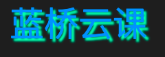
<div>蓝桥云课</div> | |
</body> | |
</html> |
预览页面,效果如下:
- 页面上有个包含「蓝桥云课」文字内容的
div标签,我们使用font-size属性设置字体大小为 50px。 - 使用
color属性设置字体颜色。 - 使用
text-shadow属性添加文本阴影效果。
# 文本溢出
text-overflow 属性可以设置超长文本省略显示,其语法如下所示:
text-overflow: clip|ellipsis; |
其属性值的含义如下所示:
| 属性值 | 描述 |
|---|---|
| clip | 修剪文本。 |
| ellipsis | 显示省略符号来代表被修剪的文本。 |
举个例子~ 👻
新建一个 index5.html 文件,在其中写入以下内容。
<!DOCTYPE html> | |
<html lang="en"> | |
<head> | |
<meta charset="UTF-8" /> | |
<meta name="viewport" content="width=device-width, initial-scale=1.0" /> | |
<title>Document</title> | |
<style> | |
p { | |
border: 1px solid blue; | |
width: 100px; | |
height: 50px; | |
overflow: hidden; /* 隐藏超出文本 */ | |
white-space: nowrap; /* 强制单行显示 */ | |
} | |
.poem1 { | |
text-overflow: clip; | |
} | |
.poem2 { | |
text-overflow: ellipsis; | |
} | |
</style> | |
</head> | |
<body> | |
<p class="poem1">木落雁南度,北风江上寒。我家襄水曲,遥隔楚云端。</p> | |
<p class="poem2">乡泪客中尽,孤帆天际看。迷津欲有问,平海夕漫漫。</p> | |
</body> | |
</html> |
预览页面,效果如下:
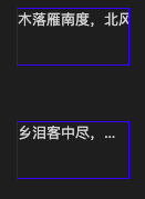
- 在代码中,我们在
p标签里分别放了一段诗,使用标签选择器给两个p标签定义了相同的样式。 - 使用
text-overflow: clip给class=poem1的p标签设置文本溢出时,修剪溢出的文本。 - 使用
text-overflow: ellipsis给class=poem2的p标签设置用省略号代替溢出的文本。
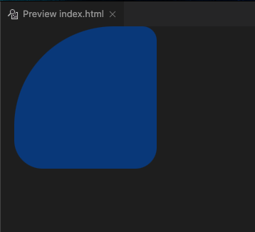
# 圆角边框
在 CSS3 中,使用 border-radius 属性来设置圆角边框。
border-radius 属性的值表示圆角的直径,可以设置四个值,其值的顺序为:左上角,右上角,右下角,左下角。
其语法格式为:
border-radius: 取值; |
我们也可以分开设置四个角的属性值,语法如下所示:
border-top-left-radius: 取值; | |
border-top-right-radius: 取值; | |
border-bottom-right-radius: 取值; | |
border-bottom-left-radius: 取值; |
举个例子~ 😉
新建一个 index6.html 文件,在其中写入以下内容。
<html lang="en"> | |
<head> | |
<meta charset="UTF-8" /> | |
<meta name="viewport" content="width=device-width, initial-scale=1.0" /> | |
<title>Document</title> | |
<style> | |
div { | |
width: 200px; | |
height: 200px; | |
background-color: rgb(17, 61, 117); | |
border-radius: 140px 20px 30px 40px; /* 四个圆角直径不同 */ | |
} | |
</style> | |
</head> | |
<body> | |
<div></div> | |
</body> | |
</html> |
预览页面,效果如下:
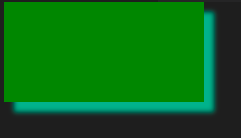
# 盒子阴影
box-shadow 属性可以用来设置一个或多个下拉阴影的框,视觉效果就像是盒子有了阴影一样。
其语法格式为:
box-shadow: h-shadow v-shadow blur spread color inset; |
其属性值的意义如下所示:
| 值 | 说明 |
|---|---|
| h-shadow | 必选,水平阴影的位置,允许负值。 |
| v-shadow | 必选,垂直阴影的位置,允许负值。 |
| blur | 可选,模糊距离。 |
| spread | 可选,阴影的大小。 |
| color | 可选,阴影的颜色。 |
| inset | 可选,将外部阴影改为内部阴影。 |
举个例子来看看吧~ 😉
新建一个 index7.html 文件,在其中写入以下内容。
<!DOCTYPE html> | |
<html lang="en"> | |
<head> | |
<meta charset="UTF-8" /> | |
<meta name="viewport" content="width=device-width, initial-scale=1.0" /> | |
<title>Document</title> | |
<style> | |
div { | |
width: 200px; | |
height: 100px; | |
text-align: center; | |
background-color: green; | |
box-shadow: 10px 10px 5px #26ad8c; | |
} | |
</style> | |
</head> | |
<body> | |
<div></div> | |
</body> | |
</html> |
预览页面,效果如下:
挑战要求:
新建一个 index8.html 文件。页面上有一个高和宽均为 100px 的正圆形 div 元素,其元素带有一个绿色的边框阴影。
打开预览,效果如下:
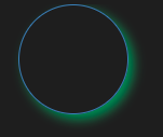
<!DOCTYPE html> | |
<html lang="en"> | |
<head> | |
<meta charset="UTF-8" /> | |
<meta name="viewport" content="width=device-width, initial-scale=1.0" /> | |
<title>Document</title> | |
<style> | |
div { | |
width: 100px; | |
height: 100px; | |
border: 1px solid steelblue; | |
border-radius: 100%; | |
box-shadow: 5px 5px 10px seagreen; | |
} | |
</style> | |
</head> | |
<body> | |
<div></div> | |
</body> | |
</html> |
# 背景新属性
在 CSS3 中增加了背景属性,我们可以更加灵活地设置背景图片。
这里给大家介绍以下新增的背景属性:
- background-size
- background-image
- background-position
- background-repeat
# 背景图像尺寸
background-size 属性可以用来控制背景图像的显示大小。语法如下:
background-size: length|percentage|cover|contain; |
| 值 | 描述 |
|---|---|
| length | 设置背景图片高度和宽度。第一个值设置宽度,第二个值设置高度。如果只给出一个值,第二个是设置为 auto (自动)。 |
| percentage | 将计算相对于背景定位区域的百分比。第一个值设置宽度,第二个值设置高度。如果只给出一个值,第二个是设置为 "auto(自动)" 。 |
| cover | 此时会保持图像的纵横比并将图像缩放成将完全覆盖背景定位区域的最小大小。 |
| contain | 此时会保持图像的纵横比并将图像缩放成将适合背景定位区域的最大大小。 |
举个例子来看看吧~ 😉
使用以下命令获取所需的图片。
wget https://labfile.oss.aliyuncs.com/courses/3773/j.jpg |
新建一个 index9.html 文件,在其中写入以下内容。
<!DOCTYPE html> | |
<html lang="en"> | |
<head> | |
<meta charset="UTF-8" /> | |
<meta name="viewport" content="width=device-width, initial-scale=1.0" /> | |
<title>Document</title> | |
<style> | |
div { | |
width: 350px; | |
height: 300px; | |
border: 1px solid; | |
color: rgba(0, 0, 0, 0.445); | |
background-image: url("j.jpg"); | |
background-size: 350px 300px; | |
} | |
</style> | |
</head> | |
<body> | |
<div> | |
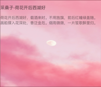
<h3>采桑子·荷花开后西湖好</h3> | |
荷花开后西湖好,载酒来时。不用旌旗,前后红幢绿盖随。<br /> | |
画船撑入花深处,香泛金卮。烟雨微微,一片笙歌醉里归。 | |
</div> | |
</body> | |
</html> |
点击预览页面,实验效果如下:
# 多图背景
在 CSS3 中,background-image 属性的属性值可以包含多个图片的地址。语法如下:
/* 图片地址 */ | |
background-image: url(), url(), ..., url(); |
若想让图片放在我们想要的位置,可以使用 background-position 属性设置图片显示的位置。语法如下:
/* 图片显示的位置 */ | |
background-position: position1, position2, ..., positionN; |
若想要设置图片是否重复显示在页面上,我们可以添加 background-repeat 属性。语法如下:
/* 图片是否重复 */ | |
background-repeat: repeat1, repeat2, ..., repeatN; |
举个例子来看看吧~ 😉
使用以下命令获取所需的图片。
wget https://labfile.oss.aliyuncs.com/courses/3429/icons8-rat-96.png | |
wget https://labfile.oss.aliyuncs.com/courses/3429/nemuel.jpg |
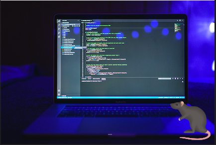
新建一个 index10.html 文件,在其中写入以下内容。
<!DOCTYPE html> | |
<html lang="en"> | |
<head> | |
<meta charset="UTF-8" /> | |
<meta name="viewport" content="width=device-width, initial-scale=1.0" /> | |
<title>Document</title> | |
<style> | |
#content1 { | |
/* 小图片来自 icons*/ | |
background-image: url("icons8-rat-96.png"), url("nemuel.jpg"); | |
background-position: right bottom, left top; /* 相对于父元素大小,老鼠图片右下角显示,大背景图片在左上角显示 */ | |
background-repeat: no-repeat, no-repeat; /* 两张图片不重复 */ | |
padding: 15px; | |
width: 400px; | |
height: 260px; | |
} | |
</style> | |
</head> | |
<body> | |
<div id="content1"></div> | |
</body> | |
</html> |
点击预览页面,效果如下:
# 渐变属性
有时候我们会看到一些好看的渐变色,在 CSS3 中也为我们提供了渐变色属性,用来设置背景的渐变色。有两种不同的渐变方式:
- 线性渐变
- 径向渐变
# 线性渐变
线性渐变是向下、向上、向左、向右、对角方向的颜色渐变。
其语法格式为:
background-image: linear-gradient(side-or-corner|angle, linear-color-stop); |
参数说明如下:
side-or-corner是描述渐变线的起始位置,它包含两个关键词:第一个指出水平位置 left or right,第二个指出垂直位置 top or bottom。angle是用角度值来指定渐变的方向。linear-color-stop是设置渐变的颜色值。
举个例子~ 😉
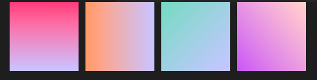
新建一个 index11.html 文件,在其中写入以下内容。
<!DOCTYPE html> | |
<html lang="en"> | |
<head> | |
<meta charset="UTF-8" /> | |
<meta name="viewport" content="width=device-width, initial-scale=1.0" /> | |
<title>Document</title> | |
<style> | |
#linear { | |
display: flex; | |
} | |
/* 从上到下线性渐变 */ | |
.gradient1 { | |
width: 100px; | |
height: 100px; | |
background-image: linear-gradient(#ff577f, #c6c9ff); | |
} | |
/* 从左到右线性渐变 */ | |
.gradient2 { | |
margin-left: 10px; | |
width: 100px; | |
height: 100px; | |
background-image: linear-gradient(to right, #ff9d72, #c6c9ff); | |
} | |
/* 从左上角到右下角的渐变 */ | |
.gradient3 { | |
margin-left: 10px; | |
width: 100px; | |
height: 100px; | |
background-image: linear-gradient(to bottom right, #8ad7c1, #c6c9ff); | |
} | |
/* 定义角度的渐变 */ | |
.gradient4 { | |
margin-left: 10px; | |
width: 100px; | |
height: 100px; | |
background-image: linear-gradient(50deg, #bc6ff1, #ffd5cd); | |
} | |
</style> | |
</head> | |
<body> | |
<div id="linear"> | |
<div class="gradient1"></div> | |
<div class="gradient2"></div> | |
<div class="gradient3"></div> | |
<div class="gradient4"></div> | |
</div> | |
</body> | |
</html> |
点击预览页面,实验效果如下:
# 重复性线性渐变
重复性线性渐变是用重复的线性渐变组成的 <image> ,它与线性渐变的区别在于,它会在所有方向上重复渐变来覆盖整个元素。
其语法格式为:
background-image: repeating-linear-gradient(side-or-corner|angle, color-stop); |
参数说明如下:
side-or-corner是描述渐变线的起始位置,它包含 to 和两个关键词:第一个指出水平位置 left or right,第二个指出垂直位置 top or bottom。angle是用角度值来指定渐变的方向。color-stop是由一个<color>组成,并且跟随一个可选的终点位置。
我们来举个例子吧~
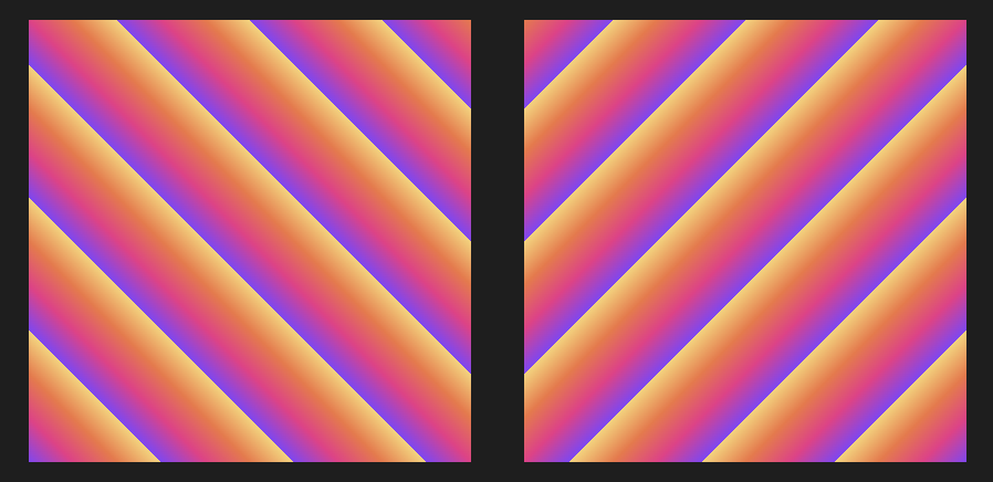
新建一个 index12.html 文件,在其中写入以下内容。
<!DOCTYPE html> | |
<html lang="en"> | |
<head> | |
<meta charset="UTF-8" /> | |
<meta name="viewport" content="width=device-width, initial-scale=1.0" /> | |
<title>Document</title> | |
<style> | |
div { | |
width: 200px; | |
height: 200px; | |
display: inline-block; | |
margin-left: 20px; | |
margin-top: 20px; | |
} | |
.item1 { | |
background-image: repeating-linear-gradient( | |
45deg, | |
#8843f8 0%, | |
#ef2f88 5%, | |
#f47340 10%, | |
#f9d371 15% | |
); | |
} | |
.item2 { | |
background-image: repeating-linear-gradient( | |
to left top, | |
#8843f8 0%, | |
#ef2f88 5%, | |
#f47340 10%, | |
#f9d371 15% | |
); | |
} | |
</style> | |
</head> | |
<body> | |
<div class="item1"></div> | |
<div class="item2"></div> | |
</body> | |
</html> |
点击预览页面,实验效果如下:
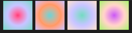
# 径向渐变
径向渐变是由元素中间定义的渐变。
其语法格式为:
background-image: radial-gradient(shape, color-stop); |
参数说明如下:
shape设置渐变的形状,其取值有circle(圆形) 和ellipse(椭圆)。color-stop设置某个确定位置的颜色值。
举个例子
新建一个 index13.html 文件,在其中写入以下内容。
<!DOCTYPE html> | |
<html lang="en"> | |
<head> | |
<meta charset="UTF-8" /> | |
<meta name="viewport" content="width=device-width, initial-scale=1.0" /> | |
<title>Document</title> | |
<style> | |
#radial { | |
display: flex; | |
} | |
/* 均匀分布径向渐变 */ | |
.gradient1 { | |
width: 100px; | |
height: 100px; | |
background-image: radial-gradient(#ff577f, #c6c9ff, #8ad7c1); | |
} | |
/* 不均匀渐变 */ | |
.gradient2 { | |
margin-left: 10px; | |
width: 100px; | |
height: 100px; | |
background-image: radial-gradient(#8bcdcd 5%, #ff9d72, #c6c9ff); | |
} | |
/* 椭圆形渐变 */ | |
.gradient3 { | |
margin-left: 10px; | |
width: 100px; | |
height: 100px; | |
background-image: radial-gradient(ellipse, #8ad7c1, #c6c9ff, #fce2ce); | |
} | |
/* 圆形渐变 */ | |
.gradient4 { | |
margin-left: 10px; | |
width: 100px; | |
height: 100px; | |
background-image: radial-gradient(circle, #bc6ff1, #ffd5cd, #b6eb7a); | |
} | |
</style> | |
</head> | |
<body> | |
<div id="radial"> | |
<div class="gradient1"></div> | |
<div class="gradient2"></div> | |
<div class="gradient3"></div> | |
<div class="gradient4"></div> | |
</div> | |
</body> | |
</html> |
点击预览页面,实验效果如下
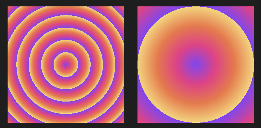
# 重复性径向渐变的使用
重复性径向渐变是用重复性的径向渐变组成的图像。它与径向渐变的区别在于,它会从原点开始重复径向渐变来覆盖整个元素。
其语法格式为:
background: repeating-radial-gradient(extent-keyword, color-stop); |
参数说明如下:
extent-keyword是描述边缘轮廓的具体位置,关键字常量如下所示:
color-stop是某个确定位置的固定颜色值。
下面,我们来举个例子吧~
新建一个 index14.html 文件,在其中写入以下内容。
<!DOCTYPE html> | |
<html lang="en"> | |
<head> | |
<meta charset="UTF-8" /> | |
<meta name="viewport" content="width=device-width, initial-scale=1.0" /> | |
<title>Document</title> | |
<style> | |
div { | |
width: 200px; | |
height: 200px; | |
display: inline-block; | |
margin-left: 20px; | |
margin-top: 20px; | |
} | |
.gradient1 { | |
background: repeating-radial-gradient( | |
closest-corner, | |
#8843f8 0%, | |
#ef2f88 5%, | |
#f47340 10%, | |
#f9d371 15% | |
); | |
} | |
.gradient2 { | |
background: repeating-radial-gradient( | |
farthest-side, | |
#8843f8, | |
#ef2f88, | |
#f47340, | |
#f9d371 | |
); | |
} | |
</style> | |
</head> | |
<body> | |
<div class="gradient1"></div> | |
<div class="gradient2"></div> | |
</body> | |
</html> |
点击预览页面,实验效果如下:
# 元素转换
transform 是元素转换属性,其属性值为转换函数,使用该属性可以让元素向指定方向移动、缩放大小、旋转等变化。
在我们的实验中,会学到以下三种转换函数:
- 旋转函数(rotate)
- 移动函数(translate)
- 缩放函数(scale)
下面我们来看看这三种函数的具体用法。
# 旋转函数
在 CSS3 中,使用 rotate 函数能够让指定的元素对象绕原点旋转,主要在二维空间内进行操作。
其语法格式如下所示:
transform: rotate(角度); /* 元素按照指定角度旋转 */ |
这里的角度可以是正值也可以是负值。正负值意味着什么呢?🤔
同学们可能已经猜到了,正负值意味着不同的旋转方向,规定参数为正时, 顺时针旋转 ;参数为负时, 逆时针旋转 。
举个例子~ 😉
新建一个 index15.html 文件,在其中写入以下内容。
<!DOCTYPE html> | |
<html lang="en"> | |
<head> | |
<meta charset="UTF-8" /> | |
<meta name="viewport" content="width=device-width, initial-scale=1.0" /> | |
<title>Document</title> | |
<style> | |
div { | |
width: 50px; | |
height: 50px; | |
margin: 20px; | |
display: inline-block; | |
background-color: chartreuse; | |
} | |
/* 向右旋转 60 度 */ | |
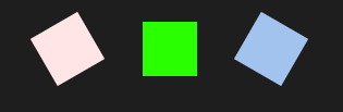
.c1 { | |
background-color: #ffe6e6; | |
transform: rotate(60deg); | |
} | |
/* 向左旋转 60 度 */ | |
.c2 { | |
background-color: #a7c5eb; | |
transform: rotate(-60deg); | |
} | |
</style> | |
</head> | |
<body> | |
<div class="c1"></div> | |
<div></div> | |
<div class="c2"></div> | |
</body> | |
</html> |
点击预览页面,实验效果如下:
# rotateX 和 rotateY 的使用
除了使用 rotate 函数绕原点来旋转指定元素外,我们还可以围绕指定轴来旋转元素。
rotateX 函数可以让指定元素围绕横坐标(X 轴)旋转。其使用格式如下所示:
transform: rotateX(角度); |
rotateY 函数可以让指定元素围绕纵坐标(Y 轴)旋转。其使用格式如下所示:
transform: rotateY(角度); |
接下来我们举个例子吧!👻
新建一个 index16.html 文件,在其中写入以下内容。
<!DOCTYPE html> | |
<html lang="en"> | |
<head> | |
<meta charset="UTF-8" /> | |
<meta name="viewport" content="width=device-width, initial-scale=1.0" /> | |
<title>Document</title> | |
<style> | |
.c1 { | |
transform: rotateX(70deg); | |
} | |
.c2 { | |
transform: rotateX(180deg); | |
} | |
.c3 { | |
transform: rotateY(45deg); | |
} | |
.c4 { | |
transform: rotateY(180deg); | |
} | |
</style> | |
</head> | |
<body> | |
<div> | |
<img | |
src="https://labfile.oss.aliyuncs.com/courses/3773/icons8-animal-64.png" | |
/> | |
<img | |
src="https://labfile.oss.aliyuncs.com/courses/3773/icons8-animal-64.png" | |
class="c1" | |
/> | |
<img | |
src="https://labfile.oss.aliyuncs.com/courses/3773/icons8-animal-64.png" | |
class="c2" | |
/> | |
</div> | |
<div> | |
<img | |
src="https://labfile.oss.aliyuncs.com/courses/3773/icons8-animal-85.png" | |
/> | |
<img | |
src="https://labfile.oss.aliyuncs.com/courses/3773/icons8-animal-85.png" | |
class="c3" | |
/> | |
<img | |
src="https://labfile.oss.aliyuncs.com/courses/3773/icons8-animal-85.png" | |
class="c4" | |
/> | |
</div> | |
</body> | |
</html> |
点击预览页面,实验效果如下:
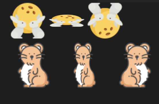
沿 X 轴旋转 180deg 的过程如下所示:
沿 Y 轴旋转 180deg 的过程如下所示:
# 移动函数
translate() 函数能够重新定位元素坐标,该函数包含两个参数值,分别用来定位 X 轴和 Y 轴的新坐标。
其语法格式为:
transform: translate(移动值); /* 元素按照指定值沿着 X 轴和 Y 轴移动 */ | |
transform: translateX(移动值); /* 元素按照指定值沿着 X 轴移动 */ | |
transform: translateY(移动值); /* 元素按照指定值沿着 Y 轴移动 */ |
举个例子~ 😉
新建一个 index17.html 文件,在其中写入以下内容。
<!DOCTYPE html> | |
<html lang="en"> | |
<head> | |
<meta charset="UTF-8" /> | |
<meta name="viewport" content="width=device-width, initial-scale=1.0" /> | |
<title>Document</title> | |
<style> | |
div { | |
width: 50px; | |
height: 50px; | |
} | |
/* 沿 X 轴向右移动 20 个像素 */ | |
.c1 { | |
background-color: #51adcf; | |
transform: translateX(20px); | |
} | |
/* 沿 Y 轴向下移动 30 个像素 */ | |
.c2 { | |
background-color: #ffe5b9; | |
transform: translateY(30px); | |
} | |
</style> | |
</head> | |
<body> | |
<div class="c1"></div> | |
<div class="c2"></div> | |
</body> | |
</html> |
点击预览页面,实验效果如下:
页面上有两个 div 元素块,使用 transform: translateX(20px) 让第一个元素块向 X 轴移动 20 个像素;使用 transform: translateY(30px) 让第二个元素块向 Y 轴移动 30 个像素。
# 缩放函数
scale() 函数能够缩放元素大小,该函数包含两个参数,分别用来定义宽和高的缩放比例。
其语法格式为:
transform: scale(缩放值); /* 元素按照指定值沿着 X 轴和 Y 轴缩放 */ | |
transform: scaleX(缩放值); /* 元素按照指定值沿着 X 轴缩放 */ | |
transform: scaleY(缩放值); /* 元素按照指定值沿着 Y 轴缩放 */ |
举个例子~ 😉
新建一个 index18.html 文件,在其中写入以下内容。
<!DOCTYPE html> | |
<html lang="en"> | |
<head> | |
<meta charset="UTF-8" /> | |
<meta name="viewport" content="width=device-width, initial-scale=1.0" /> | |
<title>Document</title> | |
<style> | |
div { | |
width: 50px; | |
height: 50px; | |
margin: 30px; | |
} | |
.c1 { | |
background-color: rgba(179, 153, 38, 0.651); | |
} | |
/* 沿着 X 和 Y 轴进行缩放 */ | |
.c2 { | |
background-color: #9088d4; | |
transform: scale(2); | |
} | |
/* 沿着 X 轴进行缩放 */ | |
.c3 { | |
background-color: #ffe5b9; | |
transform: scaleX(2); | |
} | |
/* 沿着 Y 轴进行缩放 */ | |
.c4 { | |
background-color: #1c8181; | |
transform: scaleY(2); | |
} | |
</style> | |
</head> | |
<body> | |
<div class="c1"></div> | |
<div class="c2"></div> | |
<div class="c3"></div> | |
<div class="c4"></div> | |
</body> | |
</html> |
点击预览页面,实验效果如下:
- 在页面上有四个
div元素块,第一个是宽和高均为 50 个像素的正方形元素块,我们另外三个元素块在此基础上进行缩放。 - 第二个元素块使用
transform: scale(2)让元素同时沿着 X 轴和 Y 轴扩大 2 倍。 - 第三个元素块使用
transform: scaleX(2)让元素沿着 X 轴扩大 2 倍。 - 第四个元素块使用
transform: scaleY(2)让元素沿着 Y 轴扩大 2 倍。
# 过渡
CSS3 过渡是元素从一种样式逐渐过渡到另一种样式。
其语法如下所示:
transition: 指定属性 持续时间 速度曲线 开始时间; |
它是一个复合属性,我们也可以如下分开使用这几个属性。
transition-property: 属性值; /* 指定属性名 */ | |
transition-duration: 属性值; /* 完成过渡这一过程的时间 */ | |
transition-timing-function: 属性值; /* 速度曲线 */ | |
transition-delay: 属性值; /* 过渡的开始时间 */ |
举个例子~ 😉
新建一个 index19.html 文件,在其中写入以下内容。
<!DOCTYPE html> | |
<html lang="en"> | |
<head> | |
<meta charset="UTF-8" /> | |
<meta name="viewport" content="width=device-width, initial-scale=1.0" /> | |
<title>Document</title> | |
<style> | |
div { | |
margin-top: 40px; | |
margin-left: 40px; | |
width: 50px; | |
height: 50px; | |
background-color: #51adcf; | |
/*ease-in-out 慢速开始慢速结束 */ | |
transition: transform 1s ease-in-out; | |
} | |
div:nth-child(2) { | |
transform: rotate(-60deg); | |
} | |
div:hover { | |
transform: scale(2); | |
} | |
</style> | |
</head> | |
<body> | |
<div></div> | |
<div></div> | |
</body> | |
</html> |
点击预览页面,实验效果如下:
代码说明如下:
- 在
div:hover中,使用transform: scale(2)设置当鼠标放在div元素上时,元素会放大 1 倍。 - 在
div:nth-child(2)中,使用div:nth-child(2)设置第二个元素逆时针旋转60deg。 - 使用
transition属性实现过渡的效果,其中ease-in-out是transition-timing-function属性的属性值。
接下来给大家介绍一下 transition-timing-function 属性的取值吧!
# transition-timing-function 属性
transition-timing-function 属性用来设置过渡效果从开始到结束的时间曲线,它有很多可用属性值,常用属性值如下表所示。
| 属性值 | 说明 |
|---|---|
| ease | 规定慢速开始,然后变快,然后慢速结束的过渡效果(cubic-bezier (0.25,0.1,0.25,1))。 |
| linear | 规定以相同速度开始至结束的过渡效果(等于 cubic-bezier (0,0,1,1))。 |
| ease-in | 规定以慢速开始的过渡效果(等于 cubic-bezier (0.42,0,1,1))。 |
| ease-out | 规定以慢速结束的过渡效果(等于 cubic-bezier (0,0,0.58,1))。 |
| ease-in-out | 规定以慢速开始和结束的过渡效果(等于 cubic-bezier (0.42,0,0.58,1))。 |
| steps (int,start 或者 end) | steps () 有两个参数,第一个为步长,其值必须为整数,第二个值为可选值,它有两个取值,分别是 start 和 end。 |
| step-start | 相当于 steps (1, start)。 |
| step-end | 相当于 steps (1, end)。 |
| cubic-bezier(n,n,n,n) | 规定在 cubic-bezier 函数中定义自己的值。可能的值是 0 至 1 之间的数值。 |
| initial | 规定使用默认值。 |
| inherit | 规定从父元素继承该属性值。 |
transition-timing-function 属性有这么多的属性值,我们用 steps 来练习一下吧~ 🤪
新建一个 index20.html 文件,在其中写入以下内容。
<!DOCTYPE html> | |
<html lang="en"> | |
<head> | |
<meta charset="UTF-8" /> | |
<meta name="viewport" content="width=device-width, initial-scale=1.0" /> | |
<title>Document</title> | |
<style> | |
div { | |
width: 50px; | |
height: 50px; | |
margin: 50px; | |
background-color: cornflowerblue; | |
transition: transform 4s steps(4); | |
} | |
div:hover { | |
transform: scale(2); | |
} | |
</style> | |
</head> | |
<body> | |
<div></div> | |
</body> | |
</html> |
点击预览页面,实验效果如下:
在上面代码中,用 steps 的方式将 div 元素分成四步,使元素的面积逐渐变成原来的 2 倍,当鼠标从元素上移开,又会以四步的形式将元素还原成原有的大小。
# 动画
@keyframes 被称为关键帧,它能够设置一些元素的样式,让该元素可以从原来的样式渐渐过渡到新的样式中。其语法格式如下所示:
@keyframes 动画名 | |
{ | |
0% {样式属性:属性值;} | |
25% {样式属性:属性值;} | |
50% {样式属性:属性值;} | |
100% {样式属性:属性值;} | |
} |
这里的百分比是用来规定动画发生变化的时间的, 0% 代表动画的开始, 100% 代表动画的结束,中间的可以自定义。
将 @keyframes 创建的动画绑定到选择器上,通过 animation 属性就能实现动画效果了,其语法格式为:
animation: 动画名 完成动画的周期 是否重复; |
animation 属性是一个复合属性,它的子属性如下所示。
| 属性 | 描述 |
|---|---|
| animation-name | 规定 @keyframes 动画的名称。 |
| animation-duration | 规定动画完成一个周期所花费的秒或毫秒。默认是 0。 |
| animation-timing-function | 规定动画的速度曲线。默认是 "ease"。 |
| animation-fill-mode | 规定当动画不播放时(当动画完成时,或当动画有一个延迟未开始播放时),要应用到元素的样式。 |
| animation-delay | 规定动画何时开始。默认是 0。 |
| animation-iteration-count | 规定动画被播放的次数。默认是 1。 |
| animation-direction | 规定动画是否在下一周期逆向地播放。默认是 "normal"。 |
举个例子~ 😉
新建一个 index21.html 文件,在其中写入以下内容。
<!DOCTYPE html> | |
<html lang="en"> | |
<head> | |
<meta charset="UTF-8" /> | |
<meta name="viewport" content="width=device-width, initial-scale=1.0" /> | |
<title>Document</title> | |
<style> | |
.circle { | |
width: 60px; | |
height: 60px; | |
border-radius: 100%; | |
background-color: #ffd8a6; | |
animation-name: action; | |
animation-duration: 9s; | |
animation-iteration-count: 10; | |
} | |
@keyframes action { | |
0% { | |
margin-left: 400px; | |
} | |
25% { | |
background-color: #dd7631; | |
} | |
50% { | |
border-radius: 10%; | |
} | |
100% { | |
margin: 100px; | |
} | |
} | |
</style> | |
</head> | |
<body> | |
<div class="circle"></div> | |
</body> | |
</html> |
点击预览页面,实验效果如下:
# 实验总结
本节实验主要给大家介绍了 CSS3 中的常用新特性,内容比较多,这里我们一起来总结一下:
- CSS3 新增选择器:包括新增属性选择器、子元素伪类选择器、UI 伪类选择器。
- 文本阴影:使用 text-shadow 属性给文本内容设置阴影效果。
- 文本溢出:使用 text-overflow 属性设置当内容溢出容器时,在页面上的显示方式。
- 圆角边框:使用 border-radius 属性设置圆角边框。
- 盒子阴影:使用 box-shadow 属性给元素添加阴影效果。
- 背景属性:包括 background-size、background-image、background-position、background-repeat。
- 渐变属性:包括线性渐变(linear-gradient)和径向渐变(radial-gradient)。
- 元素转换:包括元素旋转(rotate)、元素移动(translate)、元素缩放(scale)。
- 过渡属性:使用 transition 属性过渡的效果。
- 动画:使用 @keyframes 来定义动画。
# 媒体查询
# 实验介绍
CSS3 加入的 @media 媒体查询使得无需修改内容,便可以使样式应用于某些特定的设备范围。媒体查询就像是样式表中的 if 语句,通过判断表达式的真假来执行特定的分支 (加载特定的样式)。接下来就一起开启 @media 媒体查询的使用之旅。
# 知识点
- @media 媒体查询
# @media 语法
@media 可以直接写在 CSS 样式中,或者可以针对不同的媒体设备,从外部链入不同的 stylesheets(外部样式表)。接下来,一起看下两种情况的使用语法:
1. 直接写在 CSS 样式中
定义语法如下:
@media mediatype and|not|only (media feature) { | |
CSS-Code; | |
} |
一个完整的媒体查询由以下五部分组成:
- 必须是以
@media开头 。 - 使用
mediatype指定媒体(设备)类型 。 - 使用
and | not | only逻辑操作符构建复杂的媒体查询 。 - 使用
media feature指定媒体特性 。 - CSS-Code 位置是要设置的 CSS 样式。
mediatype (媒体类型)取值范围如下:
| 值 | 描述 |
|---|---|
| all | 适用于所有设备 |
| 用于打印机和打印预览 | |
| screen | 用于电脑屏幕,平板电脑,智能手机等 |
| speech | 用于屏幕阅读器等发声设备 |
被废弃的媒体类型: CSS2.1 和 Media Queries 3 定义了一些额外的媒体类型 (tty, tv, projection, handheld, braille, embossed, 以及 aural),但是它们在 Media Queries 4 中已经被废弃,并且不应该被使用。aural 类型被替换为具有相似效果的 speech 。
逻辑操作符取值范围如下:
| 值 | 描述 |
|---|---|
| and | 用于将多个媒体查询规则组合成单条媒体查询,当每个查询规则都为真时则该条媒体查询为真 |
| not | 用来排除某种设备 |
| only | 用以指定某特定媒体设备 |
逻辑操作符用于修饰 mediatype
media feature (媒体特性)常用取值如下:
| 值 | 描述 |
|---|---|
| max-width | 定义输出设备中的页面最大可见区域宽度 |
| max-height | 定义输出设备中的页面最大可见区域高度 |
| min-width | 定义输出设备中的页面最小可见区域宽度 |
| min-height | 定义输出设备中的页面最小可见区域高度 |
| orientation | 视口(viewport)的旋转方向。portrait :表示 viewport 处于纵向,即高度大于等于宽度 ; landscape :表示 viewport 处于横向,即宽度大于高度 |
如果你还想了解更多完整 media feature 取值,请访问: https://developer.mozilla.org/zh-CN/docs/Web/CSS/Media_Queries/Using_media_queries 。
2. 针对不同的媒体设备,从外部链入不同的 stylesheets(外部样式表)
用 media 属性为 <link> 指定特定的媒体类型。定义语法如下:
<link rel="stylesheet" media="mediatype and|not|only (media feature)" href="mystyle.css"> |
其中, mediatype 、逻辑操作符、 media feature 的取值与第一种直接写在 CSS 样式中的取值相同,这里不再进行赘述。
二者区别在于,第一种写在 CSS 样式中是当条件成立后,执行 CSS Code , 第二种则是条件成立后,加载对应的外部样式表。
# 使用 @media 实现网页变色龙
学习了 @media 的语法后,一起动手操练一下,使用 @media 实现网页变色龙,让你的网页在不同的屏幕尺寸下显示不同的颜色。
首先,打开你们的线上环境,新建一个 index.html 文件,然后使用快捷键生成模版。
在 index.html 文件中写入以下内容:
<!DOCTYPE html> | |
<html lang="en"> | |
<head> | |
<meta charset="UTF-8" /> | |
<meta name="viewport" content="width=device-width, initial-scale=1.0" /> | |
<title>Document</title> | |
<style> | |
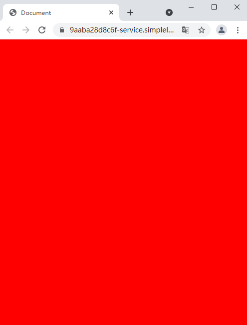
@media screen and (max-width: 500px) { | |
body { | |
background-color: red; | |
} | |
} | |
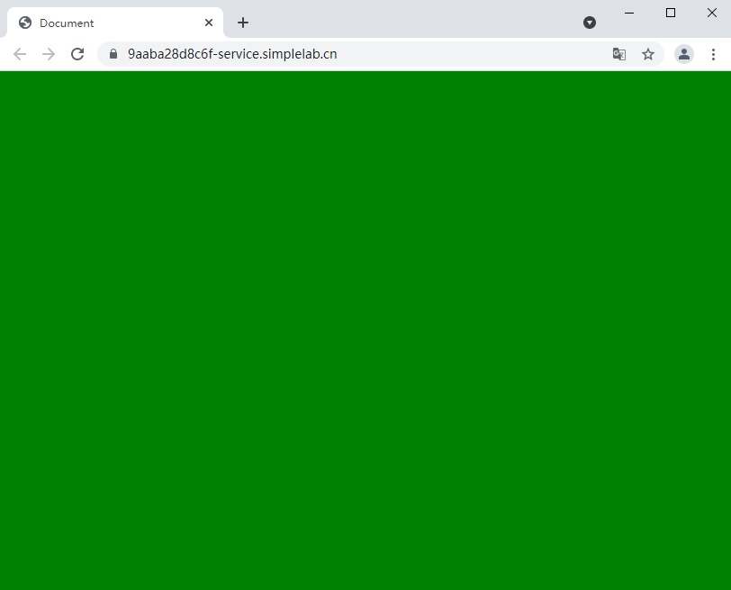
@media screen and (min-width: 800px) { | |
body { | |
background-color: green; | |
} | |
} | |
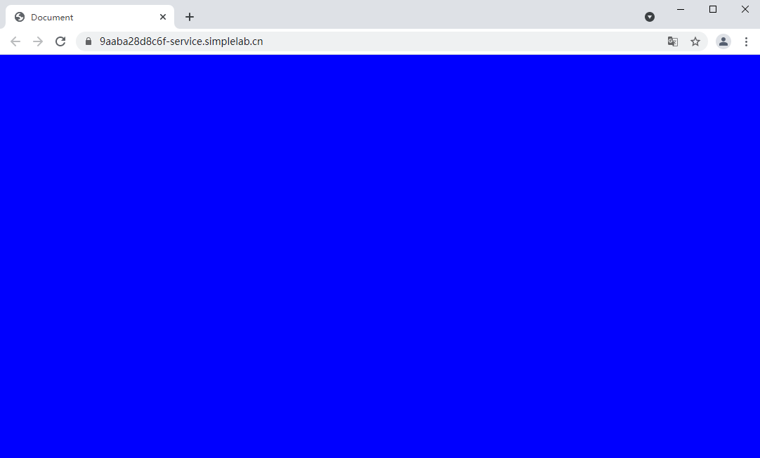
@media screen and (min-width: 1024px) { | |
body { | |
background-color: blue; | |
} | |
} | |
</style> | |
</head> | |
<body></body> | |
</html> |
上述代码做了如下操作:
- 定义媒体查询规则,当设备类型为
screen并且设备中的页面最大可见区域宽度为500px的时候,页面背景颜色为红色。 - 定义媒体查询规则,当设备类型为
screen并且设备中的页面最小可见区域宽度为800px的时候,页面背景颜色为绿色。 - 定义媒体查询规则,当设备类型为
screen并且设备中的页面最小可见区域宽度为1024px的时候,页面背景颜色为蓝色。
在上面定义的最大宽度 max-width 和最小宽度 min-width 表示的是一个范围,即小于等于和大于等于,当浏览器的宽度满足这个范围的时候,样式效果就会生效。
启动 8080 端口,打开 Web 服务,在浏览器中访问即可看到如下效果。
手动缩小浏览器宽度,当宽度大于 800px 且小于 1024px 时,页面显示绿色。
继续缩小浏览器宽度,当宽度小于 500px 时,页面显示红色。